Friday, February 29, 2008

Cleveland: Stressful?


Bizjournals.com recently published their list of the 50 most stressful metropolitan areas in the United States, where Cleveland came in second with a 6.53 stress index. Detroit claimed the top spot with a 10.64 stress index. Bizjournals.com says about Cleveland, “Right behind Detroit on the stress index is another Great Lakes metro with its share of economic woes, Cleveland. It's burdened with the group's worst robbery rate, second-worst frequency of heart attacks and strokes, and fourth-worst unemployment rate.”

I always cringe at these kinds of reports, because I think they are representative of a bunch of number-crunchers collecting data and making the numbers say whatever they want, by either including or excluding certain elements. (The list their methodology in tabulating the data here.)

It also doesn’t take a rocket scientist to determine that it would be less stressful living in a vacation destination like Virginia Beach (the least stressful metro area on their list) than it would in Detroit.

I take exception with the assumption that all the elements that they measure add up to a stressful metro area. Isn’t that a little presumptuous of them? Only one of those categories could be a deal breaker for some. For example, anyone who has driven on I-90 through Gary, Indiana (I suppose considered part of the Chicago metro area for their study) would believe Gary has got to be the most stressful area for people just VISITING the area, forget the residents. (Although I am sure those traffic jams have caused severe stress for Gary residents too.) I never spent more time in traffic than I did in a short 2 mile stretch in Gary a few years ago. It took over an hour and thirty minutes to go 2 miles, it wasn’t rush hour, it was a clear, sunny, summer day, and there were no accidents. I though the car and truck fumes alone would kill me. Maybe all those circulatory deaths in Cleveland are from residents who have had the misfortune of driving through Gary, or other cities like New York or Los Angeles? One of those alone would bring me to the brink of a heart attack.

So let’s get some perspective on this and take a look at Bizjournals.com’s data, and list the worst three metro areas from each of their categories, with their respective percentages/numbers:

Rate of per capita income growth, reflecting the average amount of money received by each resident, encompassing such diverse sources as salaries, interest payments, dividends, rental income and government checks (metro area, 2000-06 composite rate, U.S. Bureau of Economic Analysis)

WORST:
San Jose 0.30%
Atlanta 8.20%
Austin 11.60%

Unemployment rate (metro area, November 2007, U.S. Bureau of Labor Statistics).
WORST:
Detroit 7.20%
Riverside-San Bernardino, Calif. 6.00%
Sacramento 5.60%

Days of unhealthy air per year, as determined by the air quality index (AQI), which monitors five pollutants regulated by the Clean Air Act (central county, 2002-06 annual average, Environmental Protection Agency)
WORST:
Riverside-San Bernardino, Calif. 28.2
Los Angeles 18.7
Houston 9.2


Families living below the federally designated poverty level, which varies according to family size and composition (metro area, 2006, U.S. Census Bureau)
WORST:
Memphis 13.90%
San Antonio 12.70%
Houston 11.60%


Homeowners making monthly house payments of $3,000 or more, including mortgages, taxes, insurance and maintenance fees (metro area, 2006, U.S. Census Bureau)
WORST:
San Jose 33.90%
San Francisco-Oakland 30.90%
San Diego 22.50%


Deaths from circulatory-system diseases per 100,000 residents, covering such maladies as heart failure, hypertension and stroke (central county, 2004, Centers for Disease Control and Prevention)
WORST:
Pittsburgh 441.4
Cleveland 439
St. Louis 396.1


Commuters traveling at least 45 minutes from home to workplace, regardless of the means of transportation (metro area, 2006, U.S. Census Bureau)
WORST:
New York City 31.00%
Washington 29.30%
Chicago 25.70%

Robberies per 100,000 residents (central city, 2006, Federal Bureau of Investigation)
WORST:
Cleveland 947.1
St. Louis 907.2
Detroit 818.6


Murders per 100,000 residents (central city, 2006, Federal Bureau of Investigation)
WORST:
Detroit 47.3
Birmingham 44.5
Baltimore 43.3


Percentage of possible sunshine received during an average year (central city, long-term annual average as of 2007, National Climatic Data Center and Weatherbase)
WORST:
Pittsburgh 45%
Seattle 47%
Buffalo 48%


So there you have it. Cleveland only makes the appearance in the top three of two - out of ten - categories. Still not something to be proud of, but I’d rather live here than in San Bernardino, where I wouldn’t be able to breathe OR get a job. In fact, California as a whole looks pretty stressful to me.

For those of us living in the Cleveland metro area, we know that while life does have stresses, things could be a lot worse. Stress can come from a lot of places, many not even on Bizjournal.com's list. On the plus side, the Cleveland metro area has a lot to offer, things like fresh water, a temperate climate, great food, museums and other cultural attractions, pro sports teams, a great parks system, nice people, and some of the best medical care in the world, just to name a few.

So, Bizjournals.com, you can take your survey and stick it where the sun doesn’t shine – which looks like Pittsburgh, Seattle, or Buffalo.


Check out my blog home page for the latest Cleveland information,
here!

Tuesday, February 26, 2008

Cleveland’s Free Stamp


Poor Free Stamp; shunned by the company that initially commissioned the work, and almost destroyed because of a closed-minded member of Cleveland City Council, it’s as if no one wanted it. But, it’s always been a favorite of mine because it’s big, it’s bold, and it’s a survivor.

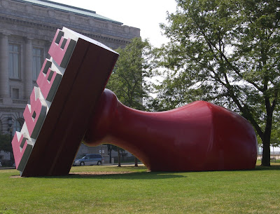
For those of you not familiar with Free Stamp, it is a large sculpture, designed by Claes Oldenburg and Coosje Van Bruggen, of a giant rubber stamp with the word “FREE” (backwards) on it. Oldenburg and Van Bruggen are well known for their sculptures of common items done to giant proportions. (Check out their web site for some examples of their work, here.)

Free Stamp’s problems had nothing to do with the quality of the work. The problem was with the interpretation of the work by a large corporation and local bureaucrats, and the sculpture’s battle to find a home where its art could be appreciated.

Here’s the story. In the early 1980s, Cleveland’s Standard Oil Corporation (SOHIO) was given the approval to demolish the old Standard Oil of Ohio building on Public Square. The company wanted a work of art outside its front doors, which is right across from one of the City’s historic landmarks, the Soldiers and Sailors Monument. Upon seeing the area with which they had to work, and considering the style of their art, Oldenburg and van Bruggen suggested creating an enormous stamp. The current design of the stamp is not what they originally proposed, which was an upright, self-inking stamp, with a red handle, large enough that people could actually walk inside the stamp. SOHIO nixed the idea citing high maintenance, so the design was retooled to look like a hand stamp on an inkpad.

Of course, the next question was what words to have on the stamp. The artists thought of something that would make a statement, yet also be something that may realistically found on a rubber stamp. Since there were space constraints as to what word could properly fit, Van Bruggen suggested the word “Free,” which would represent liberty, independence (a reflection of American ideals) and to make a positive statement in the center of the Public Square of the city.

But, nothing here ever goes without a hitch. As construction on this new design began, SOHIO underwent a management change as British Petroleum assumed increased control of the company. New management didn’t like having pop-art at their front door, much less one that had the word “FREE” emblazoned on it. (Like we would think petroleum products would ever be free or we would never be free of them?) Then, when the artists were given the opportunity to relocate the stamp, they balked, and work on the Stamp was halted for several years and pieces of it were placed in storage.

Later, when BP management questioned why the company was paying so much to store a huge stamp, interest in Free Stamp resurfaced. Mayor George Voinovich invited Oldenburg and van Bruggen to Cleveland in hopes of selecting another site.

According to the City of Cleveland’s web site,

“Although the Cleveland Museum of Art was considered, the artists wanted their work to be seen in the heart of Downtown and set their sights on Willard Park for its proximity to Public Square and because of its location to Cleveland’s government offices.

Placing the Free Stamp in Willard Park immediately drew opposition from Council President, George Forbes, who did not support the idea of the City of Cleveland accepting a rejected work of art and displaying it right outside of City Hall. Once again, the artists had chosen their location as part of their artistic statement and were unwilling to compromise their artistic integrity. This time, they threatened to destroy the work entirely if the City did not want to display it.

Before the artists could act on their threat, Election Day 1989 had passed and newly elected Mayor, Michael R. White, and Council President, Jay Westbrook, expressed their interest in this unique work. BP America finally decided that it would donate the Free Stamp as a gift to the City and offered to maintain it in its new location. City Council accepted this generous gift and the Free Stamp was brought out of storage and redesigned to accommodate its new space.

The lawn at Willard Park inspired Oldenburg and van Bruggen to alter the position of the Free Stamp so that it would lie on its side, as if it had toppled over on someone’s desk. Van Bruggen felt that the new design reflected the Free Stamp’s history as it was “flung” from Public Square only to “land” in Willard Park. Production on the Free Stamp resumed and it was brought to Cleveland in pieces to be assembled in its current spot.

The Free Stamp was officially inaugurated on November 15, 1991. The Dedication reads:
Free Stamp
Claes Oldenburg and Coosje Van Bruggen
1991- Planted Steel and Aluminum
Gift of BP America
To the City of Cleveland
Michael R. White- Mayor
Jay Westbrook- City Council President
Dedicated 11-15-1991”

And today it is still there, sitting proudly in Willard Park. Sometimes in the summer you can see kids climbing on it, and often it's being photographed. It may not be a huge icon for the City of Cleveland, but it does serve as a great reminder that we are indeed, FREE.
Free Stamp - Aerial Views

Check out my blog home page for the latest Cleveland information, here!
Sunday, February 24, 2008

Ameritrust/Breuer Tower: Its Fate In Question, Again

Previously, I’ve written in this blog about the Breuer Tower (AKA The Ameritrust Tower) and its architectural significance and ownership status. (The blog entries can be found here and here.)

Recent events again put the fate of the Ameritrust/Breuer Tower in question. The Cleveland Plain Dealer reports that the city has rejected K & D’s offer to buy the property. The Plain Dealer states that if the county does not get a bid within their deadline, the plan to tear down the building could proceed. Here’s the Plain Dealer’s report:

“Cuyahoga County rejects K&D Group bid for Ameritrust tower
Saturday, February 23, 2008
Joe Guillen and Michelle Jarboe Plain Dealer Reporters

Cuyahoga County has rejected a developer's offer to buy the downtown Ameritrust property, jeopardizing a vision for a $200 million complex of hotel rooms, residences, new office space and stores.

County commissioners will reopen bidding for the property next week but won't reduce their $35 million asking price for the buildings at East Ninth Street and Euclid Avenue.

Last month, the K&D Group, a Willoughby-based owner and manager of apartments, emerged as the only interested buyer. The company planned to put down $20 million, with the balance paid through a $15 million loan from the county.

In its conditions of sale, the county asked for all $35 million when the deal closed.

After weeks of review by the county's legal counsel, Cuyahoga County Commissioner Tim Hagan said on Friday that K&D's bid was "noncompliant."

"The $35 million we wanted was more of an if-come than a reality," Hagan said of the offer.

"We didn't feel comfortable about where the $15 million was coming from."

Reached Friday, K&D's chief executive officer declined to comment on terms of the bid or reasons it was rejected.

"We submitted a bid that we felt we could do. We looked at it as a real estate deal," Doug Price said.

"We gave it our best shot."

The developer's bid raised red flags almost immediately, as K&D's offer included a check for $250,000 - only half the required deposit.

In the wake of the subprime mortgage meltdown, banks have tightened lending, and securing money for such a major project isn't simple, Price said.

The lending climate not only affected K&D's bid but also will factor into a follow-up offer - if the developer makes one.

Price said any future salvo from K&D would depend on what the county asks for in the second round of bidding.

Commissioners officially plan to put the property back on the market at their meeting next week. A new set of sale conditions hasn't been completed.

The county is expected to consider offers in which buyers will not have to pay the full sale amount when the deal closes, Hagan said.

Prospective buyers will have 30 days to hand in bids. Hagan said he is hopeful the county will get a new bid.

If not, the county will proceed with its controversial plan to tear down the Ameritrust tower and build an administration building on the site.

The county bought the property in 2005 for $29 million, including $5 million for a parking garage.

In addition to money spent buying the property, commissioners have approved more than $33 million in contracts to build the administration complex. The county has spent $8.8 million of that money.

Work was suspended late last year when the county decided to sell.

Bay Village Mayor Deborah Sutherland - a Republican running this year for a commissioners seat - has been a regular critic of the project.

Sutherland said the breakdown of the deal isn't surprising.

"Look at how the commissioners have handled the project to this point," she said.

Commissioner Peter Lawson Jones said he expects the county will reach a deal with K&D.

"It's our intention to immediately go back out with another bid that gives greater latitude to K&D and other developers," he said.

Lou Frangos, a downtown property owner who partnered with K&D on the bid, remains enthusiastic about revamping properties including the Ameritrust Tower, designed by noted Bauhaus architect Marcel Breuer.

If K&D bows out, the Frangos Group still would be interested in the complex.

"Since we've turned in this bid," Frangos said, "I think each of us has had a tremendous amount of interest from investors outside of the city wanting to participate. And I'm still very excited about it." “


The article from the Plain Dealer can be found here.


Check out my blog home page for the latest Cleveland information, here.

Friday, February 22, 2008

The Cleveland Press


I was going through some childhood mementos the other day and found one of my prized possessions as a child – my Paper Mate pen that I won in the fifth grade for winning my grade school’s Cleveland Press Spelling Bee. I started thinking about how I used to come home from school and sit down and read the afternoon newspaper. Full disclosure – I always started with the comics section. Our household seemed to be a Cleveland Press household, because with 6 kids in the house, I don’t think anybody – including my parents – had time to read a morning paper.

Anyway, it got me thinking about the days when Cleveland was a two-newspaper town, and even as a kid, I always felt that The Press was the ONLY newspaper that was good enough for me to read.

The Cleveland Press was part of a chain of newspapers founded by Edward Scripps. The Press was first published in November 1878 as the “Penny Press” and was only a small, four-page paper. The name was shortened to “The Press” in 1884, and took the name “The Cleveland Press” in 1889. For many years, the paper was THE daily newspaper in town. According to the Encyclopedia of Cleveland History:
“By its 25th anniversary in 1903, the Press was Cleveland's leading daily newspaper. In 1913 the Press moved into a new plant at E. 9th and Rockwell (the present BancOhio Bldg. site). As it entered the 1920s, the Press neared 200,000 in circulation and maintained its political independence by proposing the city manager form of government for Cleveland and supporting Progressive candidate Robt. La Follette for president in 1924. Louis B. Seltzer became the 12th editor of the Press in 1928, and under his 38-year stewardship the Press became one of the country's most influential newspapers. Seltzer readjusted its original working-class bias into a less controversial neighborhood orientation, stressing personal contacts and promoting the slogan "The Newspaper That Serves Its Readers.""

A black mark on The Press’s record came in 1954, when it became overzealous and biased in its coverage of the well-known murder case involving Dr. Sam Sheppard. Years later, the U.S. Supreme court heard an appeal on the case, and granted Sheppard a new trial. One of the reasons for the reversal was the prejudicial publicity of the first trial, The Cleveland Press being at the heart of the problem. (I can see that the news media never learned any lessons here.)

In 1960, the paper purchased and merged in The Cleveland News, and became the city's only afternoon newspaper. A few years later, under Thomas L. Boardman, the Press’s readership declined (along with other afternoon papers in the US), and it was passed in circulation by The Plain Dealer in 1968. Scripps-Howard sold the paper in 1980 to Cleveland businessman Joseph E. Cole (Cole National Corporation). Cole introduced a Sunday edition in August 1981, and later a morning edition in 1982. But, it was too late for The Press, as advertising losses, coupled with a lackluster economy, forced the folding of the press later only a few months later.

If you’re interested in seeing some of the old pictures from the Cleveland Press, visit this web site, The Cleveland Memory Project.

These days, even with all the available news sources on television and the Internet, I still like to read the newspaper. Luckily, besides getting The Plain Dealer, I also get the News Herald. It’s nice to have a second (local) opinion. And that’s what I miss most about The Cleveland Press.

Check out my blog home page for the latest Cleveland information, here!

Tuesday, February 19, 2008

The Euclid Corridor Project

Did you know that Euclid Avenue is part of the longest road in the United States? Yes, US Route 20, known as Euclid Avenue in the Cleveland area, stretches from Boston, Massachusetts to Newport, Oregon, with a length of 3,365 miles (5,415 km).

In Cleveland, the longest road in the US is getting a much needed facelift. It isn’t just a simple repaving of the street and new sidewalks. The project will mean the addition of a BRT – Bus Rapid Transit – with dedicated lanes. These new vehicles will have exclusive lanes with a traffic control system, and the vehicles themselves will be environmentally friendly, using clean-burning fuels and batteries. There will be new methods for collecting fares that will make boarding much more efficient, and all platforms will be level and be ADA accessible. The surrounding “streetscape” will be completely redone, with beautiful sidewalks, landscaping, and passenger stations.

Even more important than the new look of Euclid Avenue will be the ability to move people through this traditionally busy area. The Euclid Corridor Project web site says, “The Rapid Transit System will connect the central business district (the region's largest employment center) with the University Circle area (the second largest employment center) and major cultural, medical and educational districts. The idea of the Rapid Transit System is to provide the quality of rail transit, while benefiting from the flexibility of buses.”

I was at Public Square in November and took a walk out to look at the work being done on the project right near the square. Construction was still going on. I’d have to say that it was a mess and quite difficult to navigate on foot, and looked even more impossible by car. However, I could see some of the materials set out for the new sidewalk area and I think it will be beautiful when it’s completed. I can understand, though, that many businesses have been hurt badly by this project while work goes on. But in the long run, this will be a huge improvement for the city and will make traveling down Euclid Avenue much easier. This should translate to improved business conditions, better than before construction began. By the way, this project was funded by tax dollars – federal, state, and city – so it belongs to you.

The Euclid Corridor Project web site has project news and updates, several pictures of the progress, and a video download of the project overview. Since the video is available for direct download, I’ve embedded it below for your viewing. If you want to download the video directly to your computer, you can find it the Euclid Corridor Project web site,here.

Project Overview


Check out my blog home page for the latest Cleveland information, here!

Friday, February 15, 2008

Those (Annoying) Local Cleveland Area Commercials

You can’t get away from them even if you tried. They’re commercials for local Cleveland area businesses. Some of them only seem to come out in the wee hours of the morning. Some get repeated ad nauseam during the morning news shows.

The question is – do they work? I suppose only the companies can tell you for sure. But one thing I will tell you, some of them will stick in your mind whether you want them to or not. Case in point, a commercial from the 1960s for aluminum siding that sang out the phone number “Garfield 1 – 2323.” I still can hear that jingle in my head after all these years, just like it was yesterday. I never knew anybody who actually got aluminum siding from them, though.

Fast forward to the present time, and you may find that the new crop of local commercials are more memorable for the wrong reasons, maybe because they annoy, maybe because they are just…odd. Here’s some of them, and why they may annoy - or entertain – you.

Fred Martin Superstore
“We’re the Fred Martin car guys – We know cars!”
My opinion: Stop yelling at me! Thank you.

Spitzer
“Our world revolves around you.”
My opinion: This slogan has been done for so long and in so many ways (some of them not so well done), that I can hear the slogan even when they don’t actually say it. I also still see the face of Del Spitzer saying the old slogan, “I want to sell you a car now!” It makes me feel older than I really am. Of course, recent commercials feature Allison, reminding us to “tell them Allison sent you.” Sorry, I still see Del. Never bought a car from them.

Sheraton Furniture
I don’t like commercials where the people trot out their kids to help sell their stuff. But, I actually have bought furniture from them because, well, they have very nice furniture. But those kids in the commercials almost made me not want to even go there. They may think that it’s their location next to train tracks that keeps people away, I think it’s those kids.

Regency Windows
“I’m gonna save you a lotta money!”
No, thank you. For some reason the windows always look like they are made of plastic. And Mikey just gets on my nerves because he yells. Why must people yell at the viewers?

Norton Furniture
“If you can’t get credit in my store, you can’t get credit anywhere. My name is Marc – and you can count it!”
For someone like me who is an early riser, one can’t possible miss Marc’s commercials that usually air at odd hours. “Now, seriously,” you can’t possibly NOT watch one of his commercials when they come on. They are the most bizarre commercials ever made, and he does change them often to keep it fresh. I am compelled to watch, but not to buy furniture. Still, weirdly entertaining.


So do they work? I still don’t know. But the fact that I could sit here and write all this information without having to look anything up for reference or confirmation is scary. They will stick in your head like a traumatic experience. And maybe for some people, it helps them to buy.

For your enjoyment, here’s a string of Norton Furniture commercials, from YouTube. Admit it, you are compelled to watch.


Check out my blog home page for the latest Cleveland information,
here!

Monday, February 11, 2008

Cleveland's New Avenue District

Artist Rendering of The Avenue District

When I was working downtown in the Tower at Erieview, my view directly below and to the east was of a dismal parking lot. Thankfully, the parking lot is now becoming The Avenue District, which, as their web site states, “will be a walkable neighborhood weaving seamlessly with The Theatre, Gateway, Civic, and Lakefront Districts and right next door to Cleveland State, and the Galleria. It will satisfy the need of urban dwellers looking for a downtown neighborhood that offers culture, entertainment, convenience, and accessibility.” By the way, don't confuse the Avenue District with The Avenue at Tower City. They are blocks apart, with The Avenue at Tower City being the shopping area by Terminal Tower.

Over 400 residential units are planned for The Avenue District, including penthouses, lofts, and town homes. Avenue District literature has loft starting at $232,390, town homes starting at $246,750, and penthouses ranging from $600,000 to over $1 million.

Building is well underway. I snapped a few pictures while I was in the area recently. It looks like it will be a great improvement over that parking lot.

The Avenue District's web site can be found here.

Check out my blog home page for the latest Cleveland information, here!

Friday, February 8, 2008

Cleveland’s Local Mid-Morning Talk Shows: A Waste of an Hour

Remember the 1950s-1960s “glory days” of Cleveland’s locally produced television shows? There was The Gene Carroll Show, Polka Varieties, Mike Douglas, Captain Penny, Barnaby, The One O’clock Club, etc. Of course, we only had three to four channels to choose from (if antenna reception was good) so we took whatever we could get and learned to love it. And even though they called it the “glory days”, it didn’t mean that the programming was very good (I was young, I hated most of it).

In the 1970’s, there was the Morning Exchange on WEWS, which provided quality local interest programming. And then…NBC’s Today show kept expanding its time slot, and cable happened, with almost endless channels choices. Local programming seemingly dropped off the face of the earth. It should have stayed there.

Both WKYC Channel 3 and WJW Fox 8 have two mid-morning talk shows, Good Company (WKYC) and That’s Life (WJW). Both really are nothing but time-fillers, although one of the two programs is marginally better.

I’ve watched both shows a few times over the last few months. I have to admit that I had to force myself to do it because these types of shows don’t interest me to begin with. But after hearing so many negative comments about them, I had to see them for myself.

Let me get this out of the way right away: Good Company is probably THE most boring hour of television I have ever seen. The primary hosts, Andrea Vecchio and Michael Cardamone, are stiff and bland. When I looked at the bios for both hosts on the WKYC website, I didn’t see a lot on on-camera experience, and I think it shows. It is hard to explain, but I almost felt uncomfortable while they were interviewing people. They didn’t seem relaxed themselves and everything seemed forced. The set itself is dull, lifeless, and visually uninteresting. Yes, I know we’re talking a local show, but it always looks like this show is “local done cheap.” And the hour.just.drags.

That’s Life, on the other hand, is a little better, but not by much. Robin Swoboda has a lot of on camera and on-air experience, so she seems much more relaxed, in fact, she’s sometimes a little too loose. She is better at improvising, and seems to be a little quicker with the wit, but at times seems almost too happy to the point of phoniness. A plus for That’s Life is that they seem to get out on the road and out with viewers. It could be that I picked the wrong days to watch Good Company, but for the several times I watched, they never left that awful studio. On the flip side, it seems that every cooking segment I watched on That’s Life seemed poorly planned and sloppily done. Good Company’s are much better; part of it may be the set, and part of it may be more qualified people doing the cooking segments.

Generally, both shows had uninteresting subject matter. There have got to be more exiciting things happening in Cleveland and in the surrounding area. I find myself wondering to what demographic they are trying to attract? It's hard to tell by the subject matter and guests. It would be interesting to know what demographic they ARE getting.

If I had to watch one of these shows again – if, for example, my TV would only tune to one channel at 10:00 AM on a weekday and I was tied to a chair in front of it – I suppose I could suffer through That’s Life. I wonder, though, if local programming like these shows are even relevant any more. Most channels have morning news on from 5:00 AM to 7:00 AM at minimum, and they seem to work in a lot of non-news segments.

I would think that both WJW and WKYC could put the money spent towards "talent" and producing these shows to better syndicated programming. It may be time for these two local programs to drop off the face of the earth. If they do, “that’s life,” but they will be in “good company” with those other old local shows.


Check out my blog home page for the latest Cleveland information, HERE!

Tuesday, February 5, 2008

Cleveland’s Dead Man’s Curve

Cleveland's Dead Man's Curve, I-90 Westbound
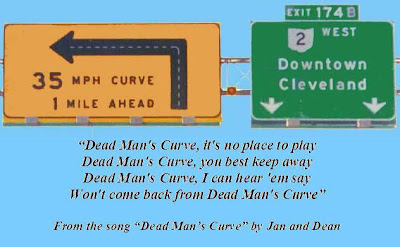
Dead Man’s Curve is one of those Cleveland landmarks that was never intended to be a landmark. The near 90-degree curve is where I-90 takes a hard left where it splits off with Ohio Route 2 westbound, or with a hard right for drivers going eastbound. Constructed in 1959 as part of the Innerbelt project (which started in 1954), it opened with a speed limit of 50 miles per hour. With this speed being far to fast for a curve so severe, it didn’t take long for the curve to become a high accident area. The speed limit was dropped to 35 mph in 1965, and in 1969, the curve was modified to include a banked turn, with improved signs and rumble strips in the road.

Despite the fact that, years later, the signs, rumble strips, 35 mph speed limit plus added concrete barriers are still in place, inevitably someone – seemingly most often truckers – misjudge the curve and wind up losing control. This can create horrific traffic snarls that affect people trying to get out of, and through, the city. The Innerbelt itself gets in excess of 120,000 vehicles a day, many of those vehicles passing through Dead Man’s Curve.

A few years ago, the Ohio Department of Transportation (ODOT) made proposals for improvements with the Innerbelt, including smoothing out Dead Man’s Curve. The Innerbelt project as a whole continues to be analyzed and disputed by many due to its potential effects on businesses by the changing of exits, and the possible effects on structures that are currently in the way of the new Innerbelt Bridge configuration. While no one seems to disagree that Dead Man’s Curve remains a dangerous area, the changes to the Innerbelt and Shoreway that need to take place in order to accomodate improvements are also in dispute.
Cleveland's Dead Man's Curve, I-90 Eastbound
In the meantime, the Innerbelt Bridge, made in the same style as the Minneapolis bridge that collapsed in August of 2007, continues to deteriorate. The Cleveland Plain Dealer reported on December 19, 2007:

“The Ohio Department of Transportation originally planned to build a new Interstate 90 bridge over the Cuyahoga River, then rehab the existing 48-year-old bridge, estimated to cost more than $140 million. But the state will speed up its repair plan and delay building the new bridge.

So in just more than two years, motorists will face this:

Eastbound and westbound traffic lanes on the bridge -- the main artery into and through downtown Cleveland -- will be reduced from four to two in each direction to make room for the work. Besides the deterioration, another reason for the change is that planning for the new bridge is taking longer than expected. So, if ODOT stuck with its original schedule, work to rehab the existing bridge wouldn't start until 2016 or 2017.…ODOT is waiting for federal highway officials to review and approve a draft of the overall Inner Belt plan, which includes softening Dead Man's Curve and improving the flow of traffic through the accident-prone "trench" in Midtown in part by reducing on and off ramps.”


So, we wait. But in the meantime, let’s all slow down and have respect for the REAL Dead Man’s Curve in Cleveland. 


Check out my blog home page for the latest Cleveland information,
HERE!